[Vaclav] [1.1.35] Artifacts on Belt Icons
Posted: Sun Jun 20, 2021 9:42 am
Dear Factorio Team,
I really enjoy the visual improvements over the last few updates,
but noticed one set of icons (the belts), are not quite on par with the rest of the icons.
and have artifacts in them. Compared to the Gear Icon (or Green Circuits), there are differences in the overall "quality" of the belt icon.
So the overall quality and art style is the same as the other icons :)
But to see a single Icon (belts), not quite on par with the rest of the icons, somewhat breaks the overall "look" of the factory.
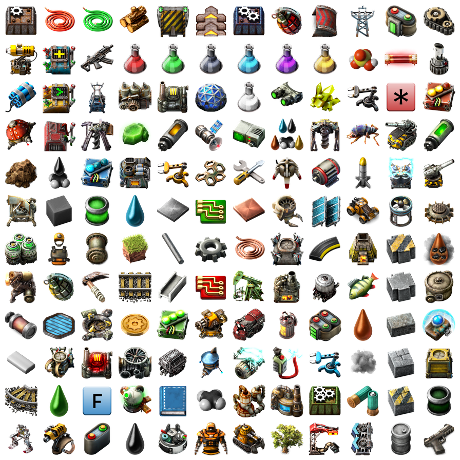
For Example, the overview (the second image). Green Science, Inserters, Ammo, Gears, everything looks high-quality except the belt icons.
Kind of a disruption of the visual appearance of the game, if you know what I mean :)
Hope this should not add a lot of work to your team!
Thank you and your team for Factorio, it is an awesome game, and I cannot recommend it enough!
Best Regards
I really enjoy the visual improvements over the last few updates,
but noticed one set of icons (the belts), are not quite on par with the rest of the icons.
TL;DR
Update/Upgrade the yellow/red/blue belt icons to match the Art Style, Resolution and "Quality" of the the other Icons in the game :)What ?
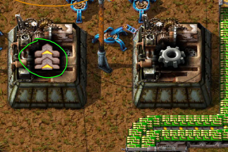
For example, as you can see here, the belt icons (in the toolbelt, on the belt itself, or on the assembler icon), are somewhat low-res,and have artifacts in them. Compared to the Gear Icon (or Green Circuits), there are differences in the overall "quality" of the belt icon.
How would you like to change that
Match the visual representation of the belt icon with other icons. Meaning high-res pictures, maybe some reflections (as in the gears).So the overall quality and art style is the same as the other icons :)
Why ?
The visual improvements of the game are a real game changer for me, and I really really like them a lot (playing the game since 0.12).But to see a single Icon (belts), not quite on par with the rest of the icons, somewhat breaks the overall "look" of the factory.
For Example, the overview (the second image). Green Science, Inserters, Ammo, Gears, everything looks high-quality except the belt icons.
Kind of a disruption of the visual appearance of the game, if you know what I mean :)
Hope this should not add a lot of work to your team!
Thank you and your team for Factorio, it is an awesome game, and I cannot recommend it enough!
Best Regards